Logo
The PlaySafe ID logo is built around a clean, modern icon paired with a distinctive wordmark. Designed for flexibility, it maintains strong brand presence across all sizes and environments. This section outlines how and where the logo should be used to ensure clarity, consistency, and recognition across all brand touchpoints.
Download
You can download our logo pack from here: https://drive.google.com/drive/folders/17sA8bYxtWjziwur0sSuqhc6aHl6VPI4Y?usp=sharing
Overview
We have three logo variations for different use cases across our communications:
Horizontal logo
Our horizontal logo is the core expression of our brand. It should be used in formal or external-facing scenarios where brand recognition is critical.
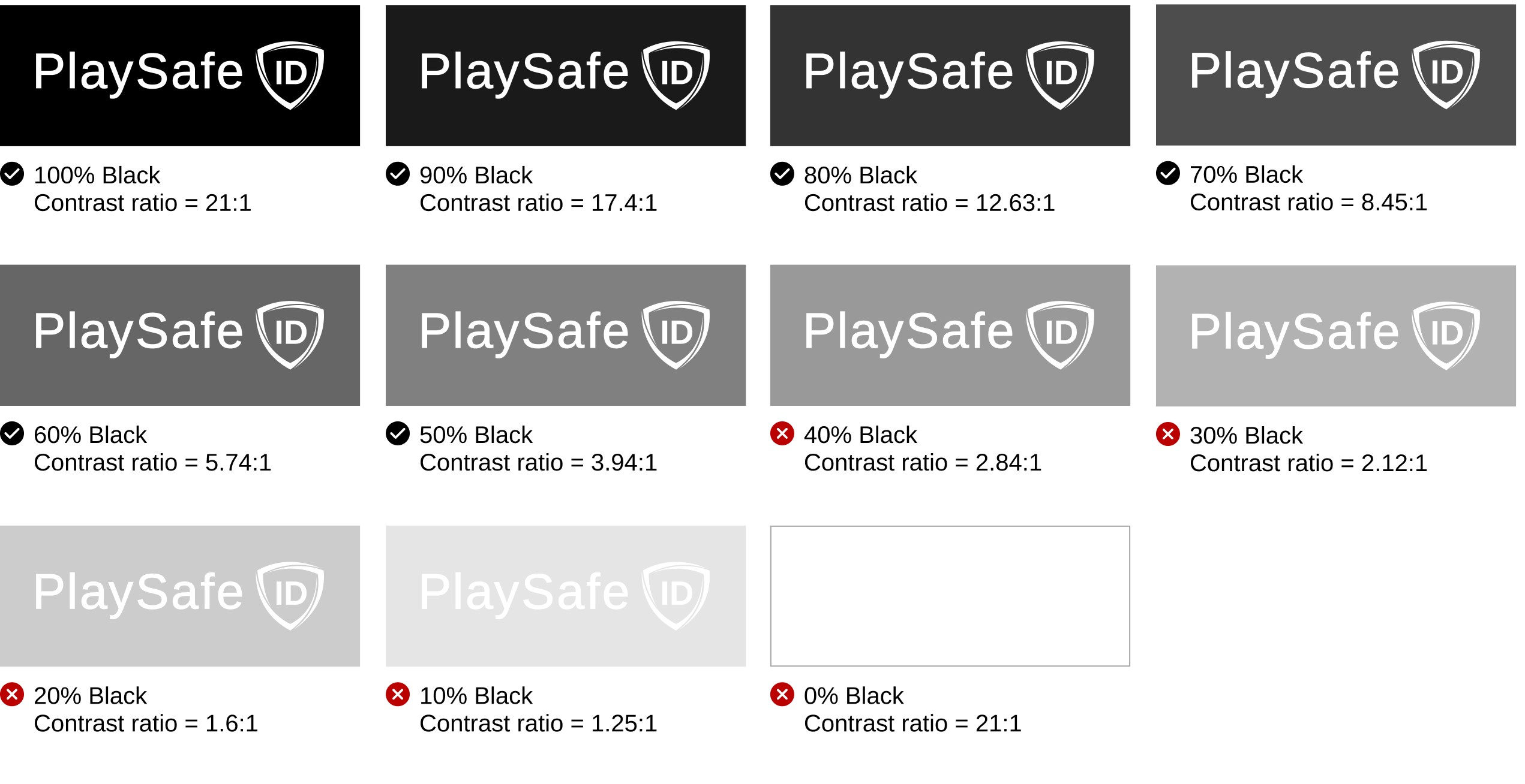
 Use white version on dark backgrounds.
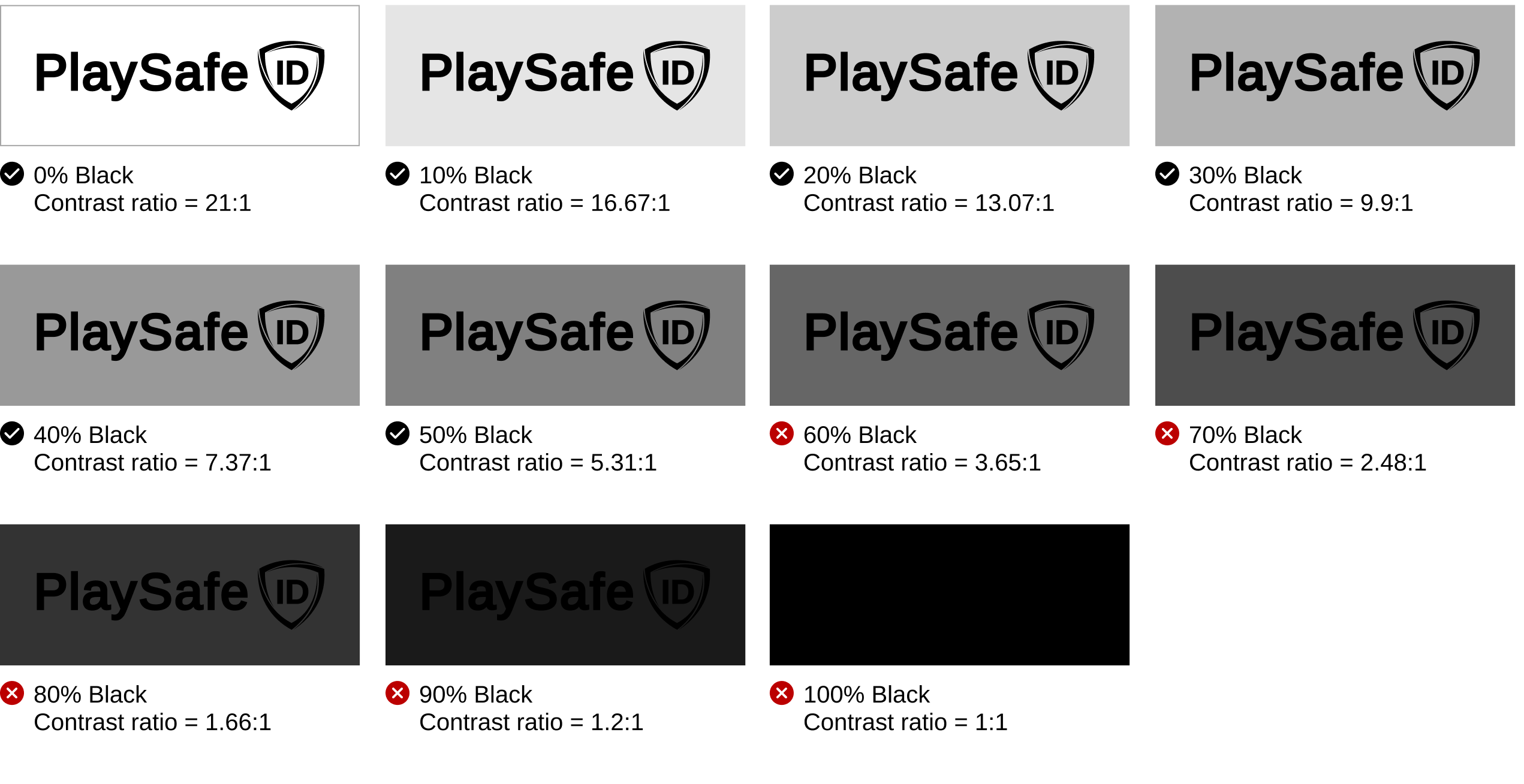
 Use black version on light backgrounds.
Shield symbol
Our icon’s clean design and close link to the product give it strong recognition on its own. This allows us to use the secondary logo confidently in spaces where the audience.
 Use white version on dark backgrounds.
 Use black version on light backgrounds.
Stacked logo
The stacked one is reserved for situations where the primary or secondary logos don’t fit due to size, format, or design constraints. When using the stacked version, keep surrounding elements minimal since the logo occupies more visual space.
 Use white version on dark backgrounds.
 Use black version on light backgrounds.
Clearspace
PlaySafe ID needs space to stand out. No crowding allowed. Keep a clear area around the logo so it stays visible and easy to recognize.
For the shield with the "ID," leave a gap around it at least as wide as the shield itself. For the full PlaySafe ID wordmark, the clear space should be at least as wide as the letter "P."

In context
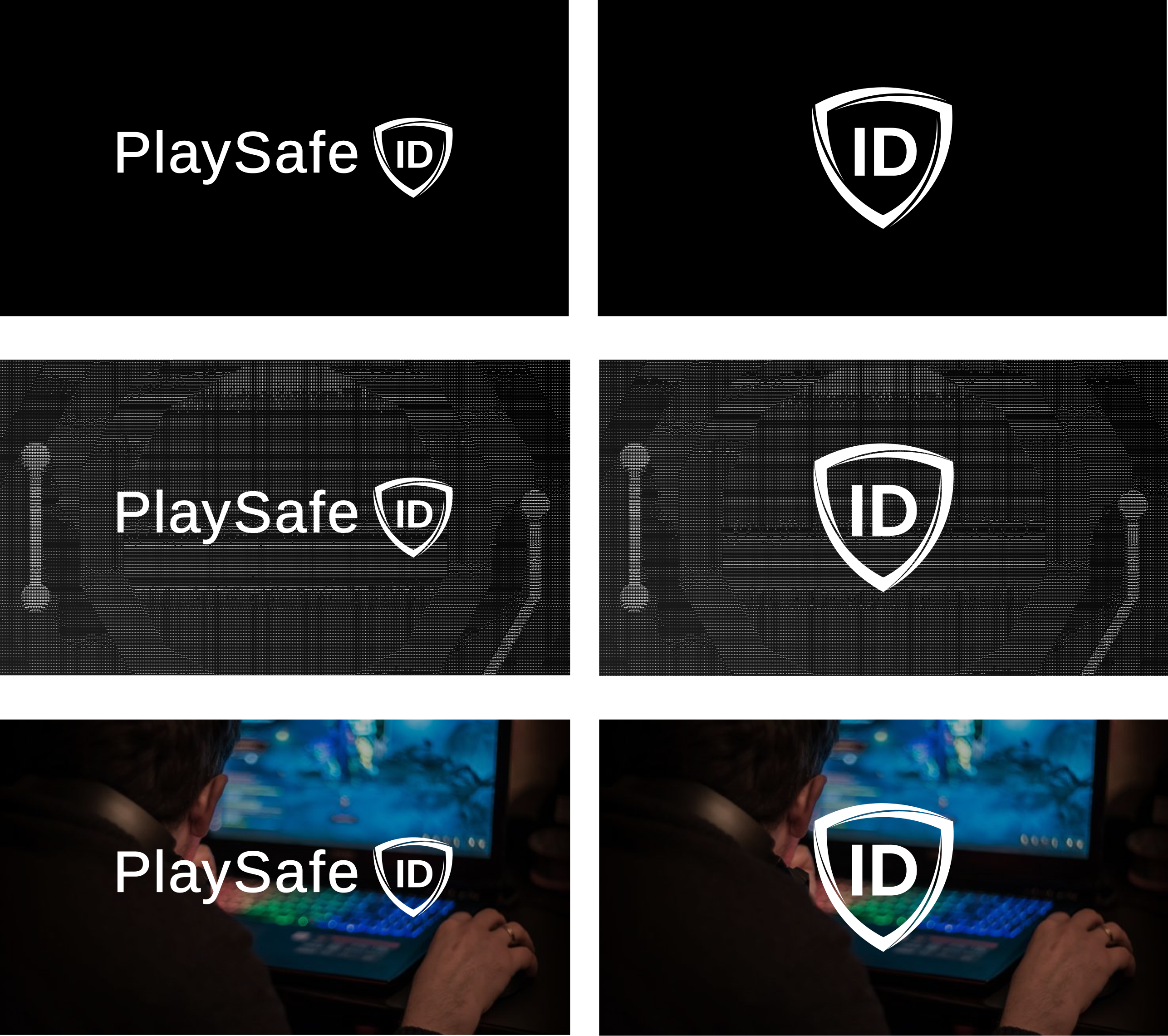
Our branding is rooted in black and white. While the logo may occasionally appear over color photography or video, always ensure strong contrast and avoid overly vibrant or chaotic visuals that compete with it.
Readability
Always make sure the logo stands out clearly. When placing it over any background, maintain a minimum contrast ratio of 3.9:1 to ensure legibility. If the contrast isn't strong enough, tweak the background or select a more suitable one.
Co-branding guidelines
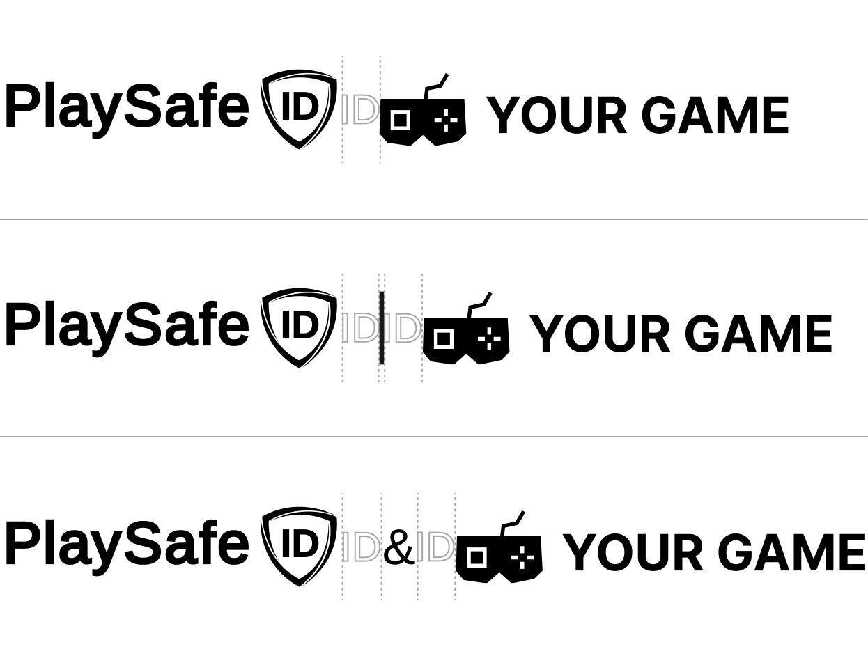
In select partnerships, co-branded logo lockups may be approved. When used, our logo should typically appear first, and it’s important to maintain equal visual weight, spacing, and alignment between both brands. Stick to the clear space rules to ensure clarity and balance.
As a rule of thumb: if the partner uses an icon or symbol, use our symbol as well. If they use their full wordmark, match with our full logo. You can also consider brand recognition levels in your market. In regions with higher brand familiarity, the symbol may be more appropriate.
The element that separates the two logos (a line, shape, or other graphic) can adapt based on the context of the collaboration. Our default separator is the gray rule, but you're free to adjust its style to suit the environment, as long as the separation remains clear and intentional.
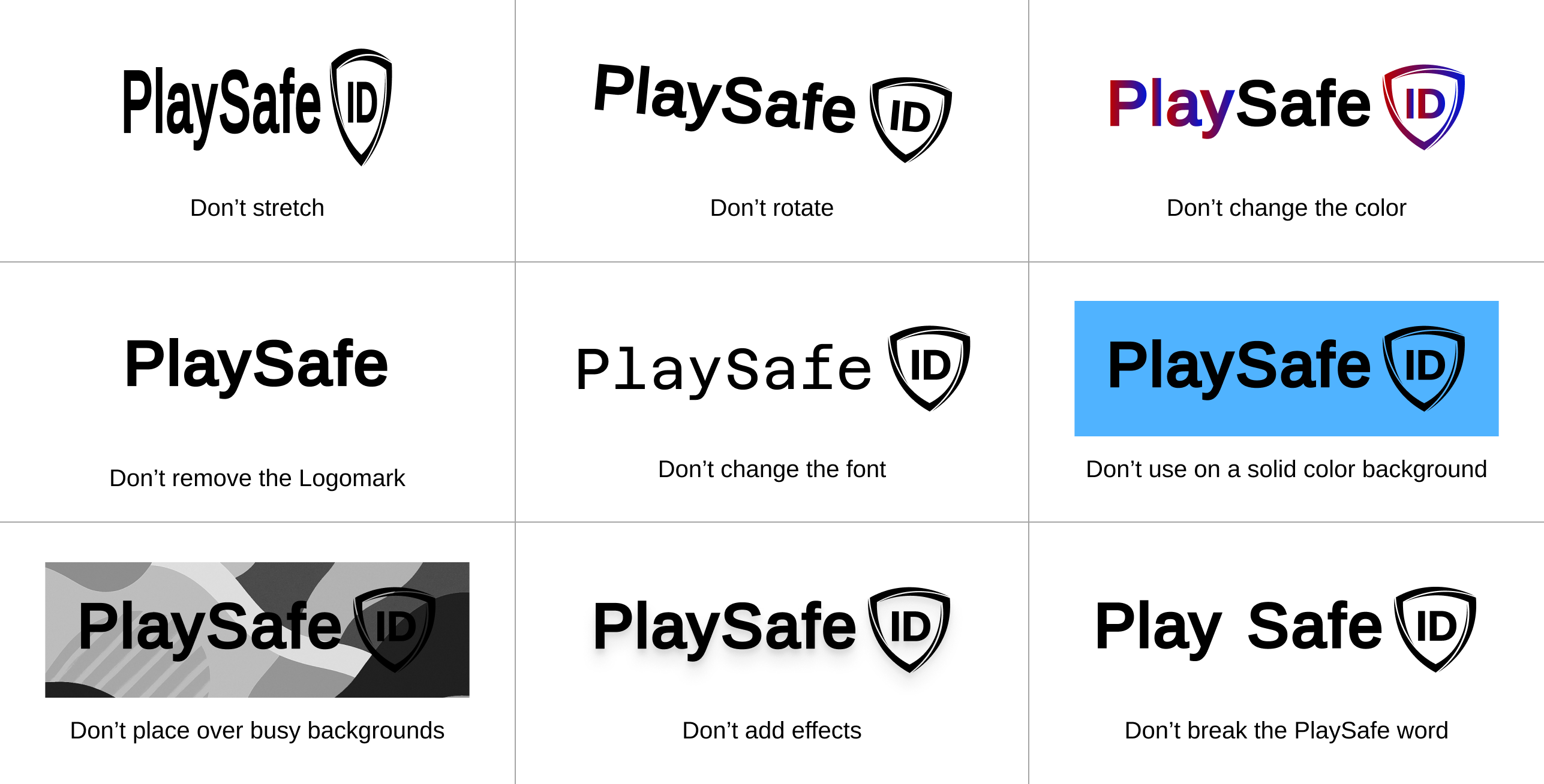
What to avoid
Our logo is a key element of our identity. Misusing it weakens the brand and creates confusion. Here are some examples to steer clear of. Keep the creativity where it counts, and let the logo do its job.
Examples in context
Coming Soon
Updated 3 months ago


